Friday 6 February 2015

update, september - december projects!

before the christmas holidays we are all expected to make a portfolio of our work to date, from starting back in september to present time. We then have prescheduled appointments with our tutors to talk about progress and the future.

My PDF: 


Jonathan Cape, graphic novel competition, brief set in May - September.
We had to think of a narrative and then illustrate it for submission to the Jonathan Cape short story project with the Guardian. I found this really difficult and my brain was fixed in summer mode so I had to make do with one idea and run with it relatively close to the deadline as I couldn't make an educated decision. It turned out ok and it was a big learning curve for the future- even now, 5 month on I can really appreciate this project and how far i've come since.


Beyond The Frame project- This project was with Rose Blake and was influenced by the Tate Britains permanent collection. We were each given one piece from the collection at random and were told to research it and create a piece of work in response to it. I got The Beef of Old England, a very famous painting from Hogarth, artist renowned for his social satire. I wanted to look at the idea of social classes, as someone who really loves the work of Hogarth, I liked The Beef Of Old England, but it wasn't my favourite piece by him,  I much preferred the Rakes Progress series which looks at the life of Tom Rakewell as he goes through social classes until his death. I did a lot of research into social tropes and the 'taste tribes' as Grayson Perry calls it in his TV documentary, The Vanity Of Small Differences. I am really interested in Middle Class taste and what people in that social class precieve as good- normally influenced by their peers, Cath Kidson and wanting to look 'Cultured' I really wanted my table cloth to look like something an unknowing person of middle class social standing would buy, looking at a distance at a pattern similar to a Cath Kidson but not realising that it holds connotations of working class traditions, tattoos, football hooliganism and council estates.


On location illustration at the British Museum


Summer Project Collaboration for the BFI, Illustrated article on YEARBOOKS


Work in progress sketchbook research for Conversation Project. In the briefing for the conversation project we were all given a number at random which corresponded to a book in the library which we were told to pick a quote from and illustrate using text- we then all ran down to find our books to get started! Very exciting. I got a book on photography during the Apartheid which I found very challenging throughout, I am very awake of my own personal privilege as a white girl who has grown up in a very white dominated area of the country and one thing that annoys me no end is the amount of white artists who produce work for an issue that they could never understand or comprehend. Misrepresentation is terrible especially when the topic is as important as this. So, after much deliberation I decided to look into process and the force of oppression which lead me to looking at traditional letterpress. Traditional letterpress has it's own rules and a very specific way of thinking- the letters are forced to conform within a small frame and pressure forces them together and into making a mark on the page. Which I thought related nicely to the idea of oppression. I went back to my book- and looked through for an appropriate conversation to illustrate- until I realised that the piece as a whole would be more effective if I used a quote from the book on traditional letterpress that could also be read in the book on the Apartheid, in which I found "IT WAS PHYSICALLY DRAINING, MEDICALLY DANGEROUS AND OFTEN TEDIOUS". I decided not to use ink as I just wanted a faint indent into the page- just the feeling of pressure. I had a lot of difficultly as I was using letters meant for leather- which were not a complete alphabet which meant a lot of arranging + sticking with double sided tape, pressing using the hydraulic press, rearranging and repressing, hoping that the paper would remain in the same place. It was a long process with a lot of trial and error, but i'm pleased with the result. I probably should experiment with laser cutting the text and pressing that way, for future reference.

Conversation Project final image


Experimental Life Drawing 


Experimental Life Drawing


Pencil Sketches from Grant Museum of Zoology 


Illustrations from London Fashion Week 

Personal Project experimenting with ceramics + glazing

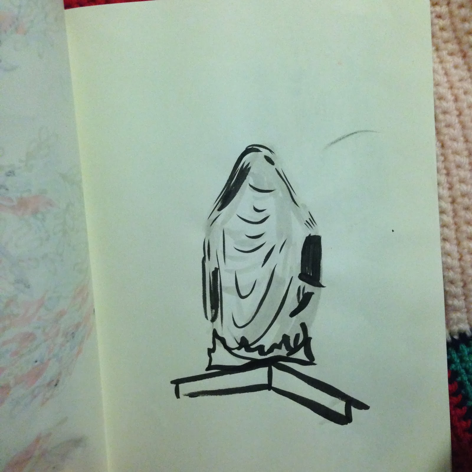
Sketchbook Journal Pages

I designed some simple polymer clay necklaces and stitched drawstring bags to sell them in to help raise money for our degree show next year. The bags and the tags were screenprinted by me at uni! I then used my sewing machine and a lot of patience to sew the bags up!


Final piece for the beyond the frame project, a silk table cloth celebrating working + middleclass taste. 

Thursday 5 February 2015

BFI PIECE


An overdue piece about my work with the British Film Institute over summer. A really exciting and positive experience overall! It is still really exciting to see my first ever published piece on the website of such a prestigious organisation! Hopefully this is only the start of much bigger things, as I really enjoy writing alongside such a visually graphic course.

We were commissioned to write a short 100 word piece about a film character that we wanted to be,  I wrote about Enid Coleslaw, heroine of Daniel Clowes graphic novel, Ghost World and in the film of the same name. I really wanted to make a point of the fact that it was refreshing to watch and be part of a story where the main character was multifaciated, interesting AND problematic, as a preteen girl this was something really insightful and refreshing. I was bored of cheelearders and highschool tween dream movies.


You can read my piece online here

Thursday 4 September 2014

First Year Portfolio

Due to being incredibly busy throughout the year and not wanting to talk about a project after i've spent 3 consecutive all nighters on it- this blog was left a bit desolate. However as a recap on the year I thought I would talk a bit about the projects that featured in my end of year portfolio and some of my favourites.


My final major project which spanned 8 or so weeks was taken from a one day project we had at the beginning of the year entitled "The Human Echo". I was experimenting with the idea that in todays society we are hugely focused on our internet presence and the preservation of it after we die.  Another area I was interested in was the idea that everything that is written on the internet, every search engine query, every comment, every photo that is posted gets archived. There has been constant battle that families face when their loved one dies not only with their tangible belongings but with their facebook profiles/ email accounts ect. So much so that in 2009 facebook decided to allow family members to memorialise a loved ones account- since then it has been estimated that over 30 million accounts on the site are inactive due to death of the owner. However if you wish for the account of a loved one to be removed off the site you will face another battle, due to the unread t&c of the site which states that they have ownership of everything that you have added and can do with it what they please- (seeing a deceased loved one on an advert maybe something that is with us in the future, who knows.) So with this in mind I decided to make sense of our permanence on the internet but in a more tangible way. I went about downloading my entire facebook archive which was HUGE for my small 4 years on the site. I then created a vessel for my data in the form of a traditional burial piece- an urn. Before it was biscuit fired I filled the urn with my data and during the firing the information cremated leaving ash. I had an event of this and allowed people to be their during the ceremony and pay their regards. The invitation posted on facebook of course was open to anyone who was interested : (pasted here-!!)


WW1 project !! My tutor really hated this piece and only gave me a satisfactory !  but i don't really care because I really enjoyed making it and playing with different textures and shapes. Although it doesn't look very scary I think aesthetically the pink compliments the light grey very nicely.


Animatic project with Ariel- we had to develop a story using 3 stock images. 
   
I got a great opportunity to take some photographs behind the scenes as part of katies fashion 'photography and styling' brief ! It was so much fun to be a part of it :--)

One of the first projects of the year was called 'one panel narrative' where we had to illustrate as many actions as we good going on in one image. This is one of the projects that i'd like to revisit in the future as it was only a one day project + I want to redo it !

I created a short animation for The adaptation project where we had to adapt a piece of literature. We were given The Nose by Gogol where a man loses his nose and then finds it human sized walking around and of an upper class to himself. My idea was focused on a dream entering your nose.

 Us and them week project- in which we had to make an outcome using a set of mediums (print, 3d, collage) I chose to use print as it is something I want to learn a lot more about. My initial focus was on the idea of tourism in less economically developed countries as it's something that I find quite problematic. For example tourism brings a mass of jobs and boosts the overall economy, however this then can be exploited, workers underpaid and many beauitful areas of an untouched island destroyed- tourists can be ignorant and insulting to residents over their homes and views. It really is a double edged sword. After I did more research on the subject I found that duing the huricane disaster in Hatiti (a country close to my heart) a cruise liner docked on the shores whilst mere miles away hundreds of families were trapped under buildings, needing urgent medical attention and many were dead. The red cross hadn't got to the site yet- although a cruise liner did allowing hundreds of tourists to soak up the sun and leave without realisation of the devastation they had just left. According to a source/ many people who had written complaints to the cruise liner online- there is a metal gate been put up around the beach area of the complex, separating tourists from locals and also forcing the perception of tourists to see the island as a pleasant stop off point- during this time they are treated to massages, cocktails and a large buffet of food. Armed guards stand blocking the gated entrance of the area and there are starving locals standing the other side of the gate watching as the buffet gets consumed. With this in mind I wanted the image to have two sides which you can only see when you lay a piece of paper over the image/ or through "rose tinted glasses". Unfortunately working in screen printing was difficult and I found that i didnt get the results I wanted with the details + I also found it difficult to match the blue gel with the blue printing ink but after talking to my tutor i found that that kind of match was impossible due to the opacity + shade of the blue print compared to the translucent nature of the gel. Here is example footage: here

This is another group day project we had where we had to bring in a book and make it extraordinary ! We had 5 hours to do this, we worked really hard and managed to gather all the necessary equipment to turn this book on pond life into a book which you could use, learn + research whilst at the pond! Pages were laminated so that they wouldn't get soggy, the front had a lovely piece of textured moss, it also had a little built in specemin jar and a pair of magnifying glasses built into the back cover so you could lay the book on the lake and see whats going on ! oh and the cover was filled with foam so it would float!


.....and lastly my collection project! I decided to take on a large challenge with this one, my grandmother who has never thrown anything away let me gather every single (almost) letter that had ever gone through her door. There were bank statements, love letters, charity bin liners, elvis magazines, letters from daniel o'donnel, airmail letters - you name it ! So I spent a long time chronologically organising and scanning each one by one before loading them into indesign for a 600 page book. The bottom image is the back + front cover. I'd really love to get it properly printed so fingers crossed + im probably going to approach a publisher in the new year with it :--) here is a video of me flicking through it quickly.
i got full marks !


Tuesday 5 November 2013

week commencing the 7th october

For the next three weeks we have three single week projects, The Walk Cycle, Life Drawing and The Human Echo project. My series of projects commenced with the life drawing module. I had previously had a lot of anxieties about life drawing from my past experiences, stuffy rooms, long poses and a critical "thats not in proportion" adjustment by my teachers at A-level. It was either traditional (their preference)or labeled "not good". I understand that it is a key skill but if it's not fun it becomes monotonous, unengaing and frustration causing, aka all the things art SHOULDN'T be. It was however such a relief that the tutor was interesting and expressive and allowed us to be as abstract as we wanted. He talked about how when we are drawing a figure we see reoccuring symbols from their appearance and draw from memory without actually looking. An ear doesn't become the same ear as the models but one from memory ect. A lot of 5 second drawings, a lot of looking at the model and not on the paper, a lot of quick fire expressive charcoal outcomes, very fun and VERY exhausting. I took a lot from it- it was very interesting and the ideas were backed up by clear views-( the guy had to be good, we found his sessions online for £1000 a pop!!!)
Some drawings I did over the first couple of days:


On the third day we had a different tutor who allowed us to do much longer poses using whatever medium we wanted. I chose to use ink and the piecesI created in the series below are my favourite to date, especially the square image of the bike seat. Although both tutors had very different approaches to the subject I feel like I got a lot out of the sessions. The third day session definitely focued more on composition and proportion (more traditional)- and the first two days on being expressive and using light to make a flat image. I reckon if it hadn't of been for the first sessions being so free and expressive I would of acted differently to the limitations that were put on in the last session (probably negatively)


!!!!
then we had to do two hour long drawings using chalk pastals which were, to put in the nicest way possible- tragic. Gross and smudgy and they didnt last very long at all AND as soon as you picked up the paper half of the colour fell off (literally) and messed up the whole page/ made everything blurry. urgh


After tuesdays session our tutor said that because we worked so hard, our drinks would taste nicer that night. Not only did the drinks taste nicer, i had one, two, probably three too many. The second years threw a wonderful welcome party for us, disco music, drinks tokens, food and lovely lovely company.
this is a drawing someone did of me!

our tutor as a pinata

oooooh lovely su bar vibes + facepainting! 


4th October

slightly late, a series of pictures from my film camera (r.i.p) from the last days of term, brixton and my second on location drawing at Abney Park cemetery


Abney Park in all it's beauty. 


Some drawings I produced from the trip;